Shipped · HTML/CSS2025 · Capital Advisory · Zero-to-One
Four Bridges — Capital Advisory Website
Indian investment advisory runs on relationships. There's no digital layer — no way to qualify a prospect before a call, no way to establish credibility before someone Googles you. Four Bridges needed a platform that could do that job first.
Indian investment advisory runs on personal networks. No digital layer, no intake process, no way to qualify a prospect before picking up the phone.
What I did
End-to-end ownership: IA, brand strategy, copy, UI design, build, and deployment. Root diagnosis — no presence meant no awareness, regardless of offering quality.
What changed
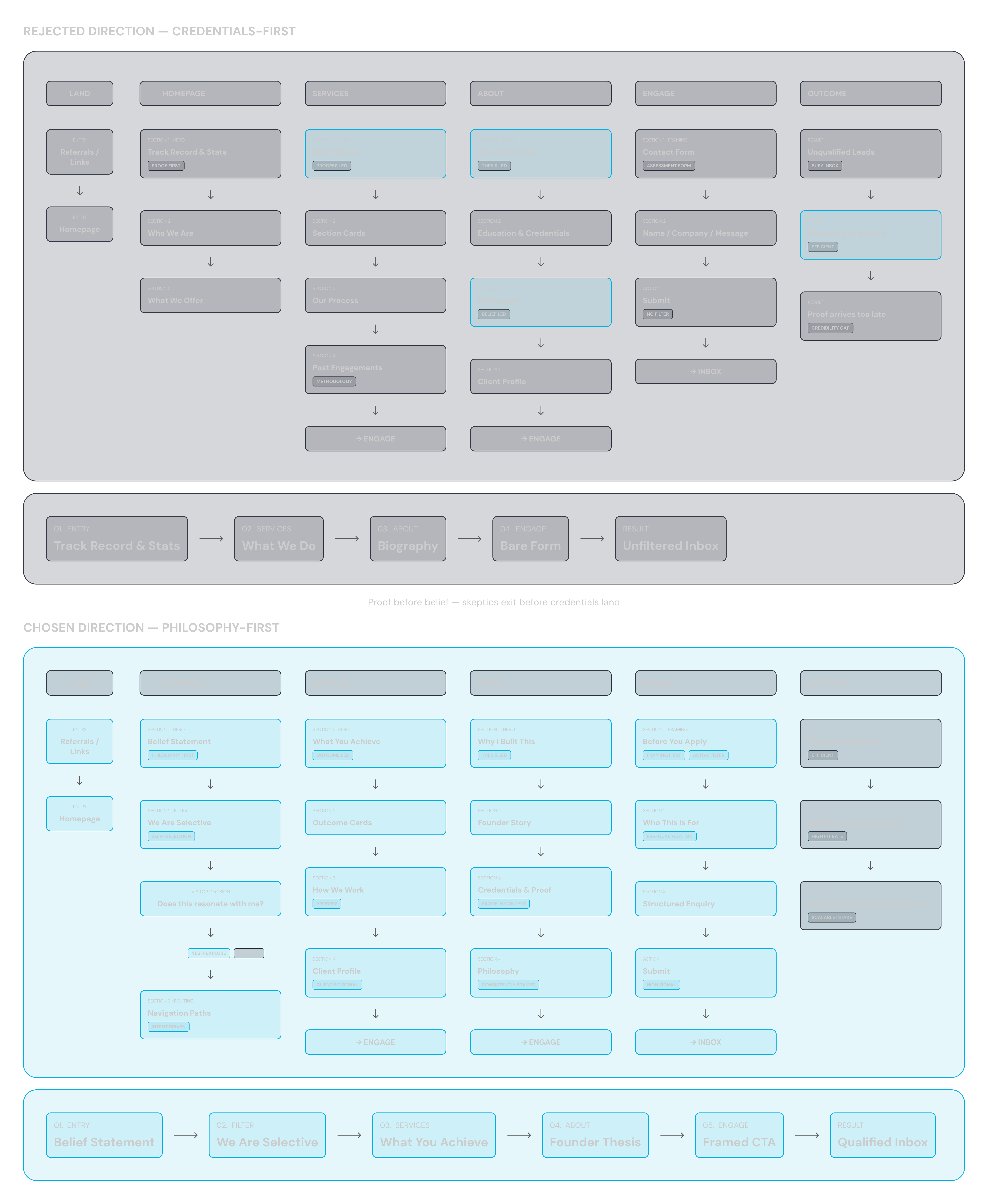
The platform now pre-qualifies leads by design: the 'We Are Selective' section filters at the point of highest intent before any human interaction begins.
01 — Problem
Build credibility with no conventional proof
A referred founder Googled Four Bridges before their first call, found nothing, and arrived sceptical. That single account contained the entire design brief: establish credibility and structure the intake process — with no client logos, testimonials, or transaction references.
The firm's differentiators were structurally invisible. Independence can't be screenshotted. Direct founder access can't be photographed. Every standard trust signal — logos, AUM figures, deal references — was either confidential or inappropriate to show. The only material available was founders' career history, a clear set of beliefs, and the precision of the thinking itself.
"Build a deal origination infrastructure using only structure, language, and the founder's biography."
Project framing — the distinction that shaped every architectural decision
02 — Key Constraint
The right client is rare. The wrong one is costly.
The founders' direct involvement is the product. A calendar full of the wrong conversations destroys it. The platform had to do two opposing things at once: invite genuine enquiry, and signal clearly enough who it isn't for that wrong prospects disqualify themselves before reaching out.
⚡
The binding constraint
No logos. No testimonials. No AUM figures. No deal references. Every conventional proof point was either confidential, inappropriate, or nonexistent. The argument had to be built from scratch — using structure, language, and positioning alone.
Real work to show — no public evidence to referenceTwo people are the entire firm — and the entire productTrust required before any conversationNo client names — confidentialityBoutique tone must survive institutional credibility claims
03 — Key Decision
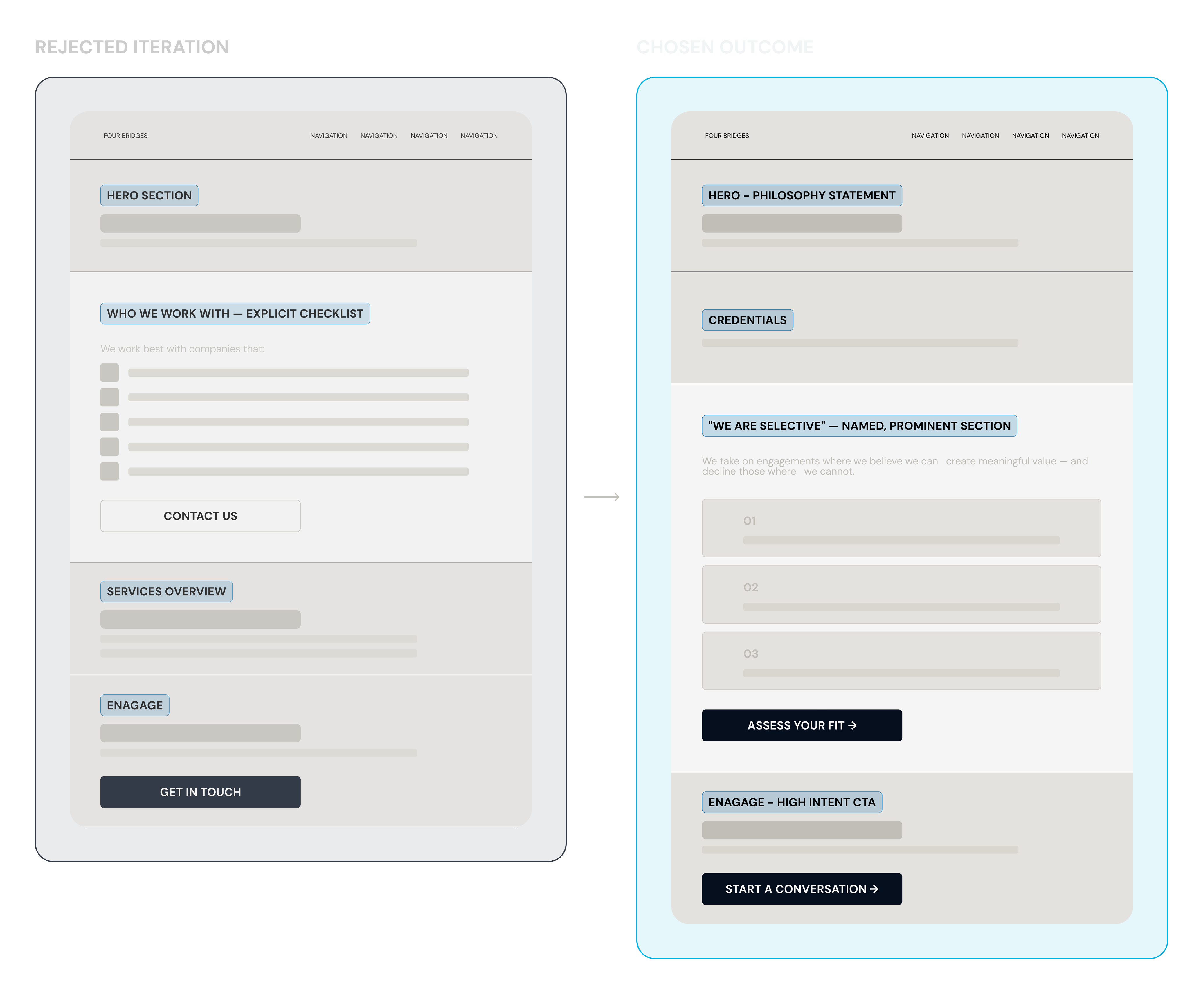
Make selectiveness a feature, not a filter
The central design question: how do you qualify leads without feeling exclusionary? A blunt 'we only work with X' reads as rejection. No qualifier at all means every wrong conversation lands in Founders' inbox.
⚡How do you qualify leads without feeling cold or exclusionary?
What we chose
"We Are Selective" — a named, prominent homepage section placed before the Engage CTA. Paired with an "Assess Your Fit" CTA routing to a structured intake form. The section doesn't list requirements. It describes the ideal client with enough specificity that non-fits self-identify — and genuine fits feel seen.
Tested with founders at different stages, the selectiveness signal landed differently than expected. Rather than discouraging outreach, it increased confidence in the enquiries that came through. Founders who felt they passed the filter arrived at the first call more engaged, less sceptical. The section functions as a pre-qualifier, not a barrier.
04 — Solution
Five pages. One narrative sequence.
Every section either advances trust, activates self-qualification, or routes the right prospect toward engagement. The homepage doesn't sell — it sorts.
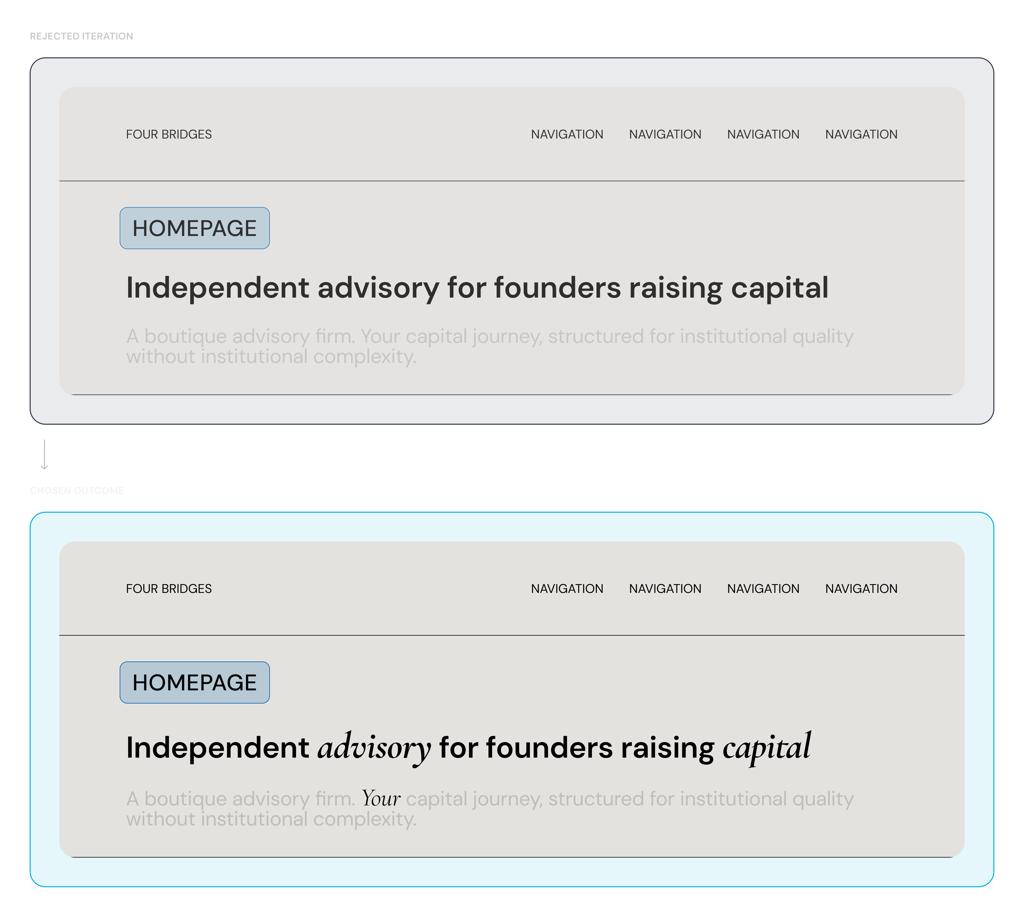
Copy was a design output, not a hand-off. The italic emphasis device came from a copy decision, not a visual one: serif italics on phrases like 'your situation' and 'your business' accumulate as personality without advertising it. Every test version without it felt colder.
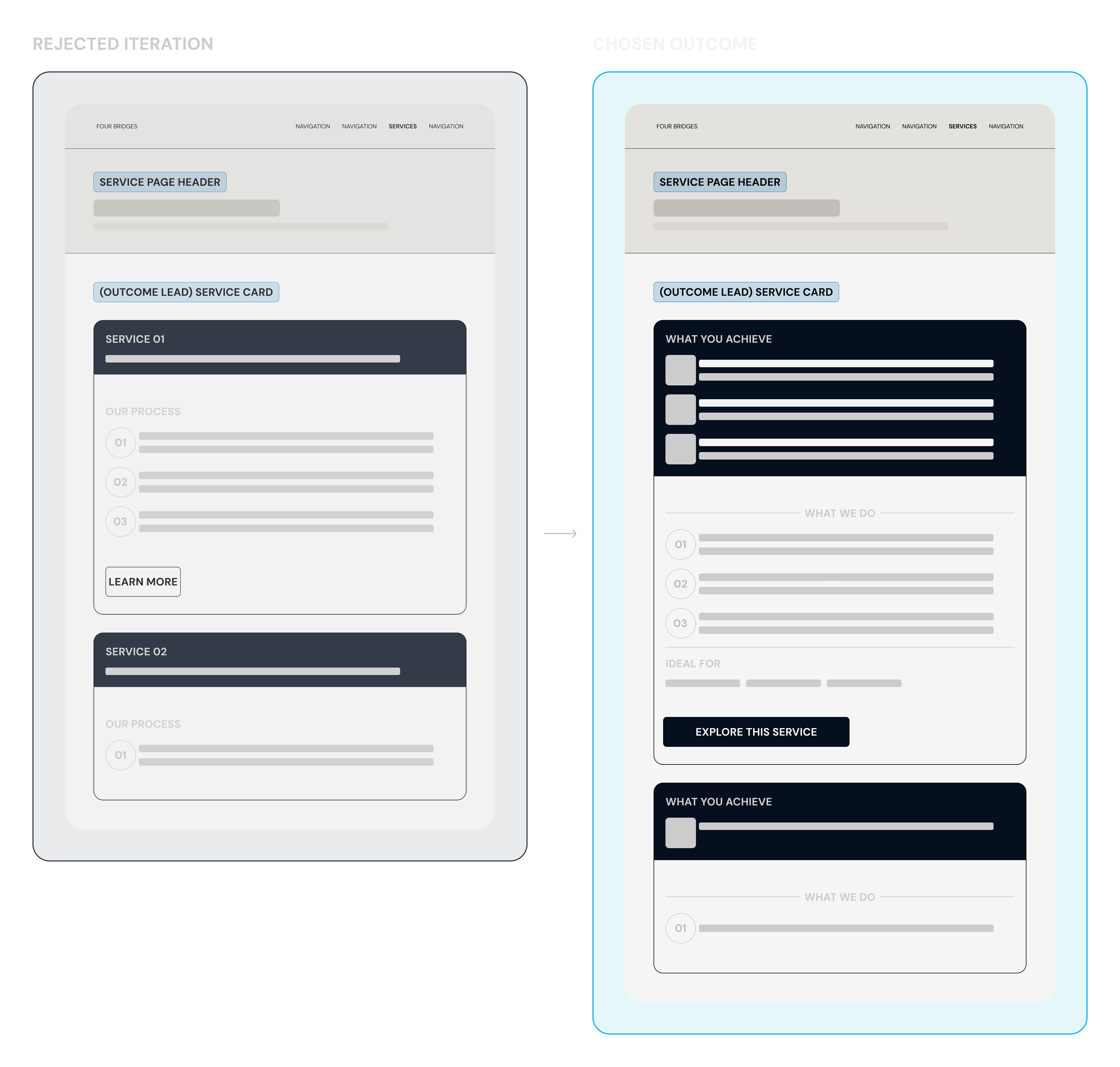
Services: outcome-first — what you achieve before how it works
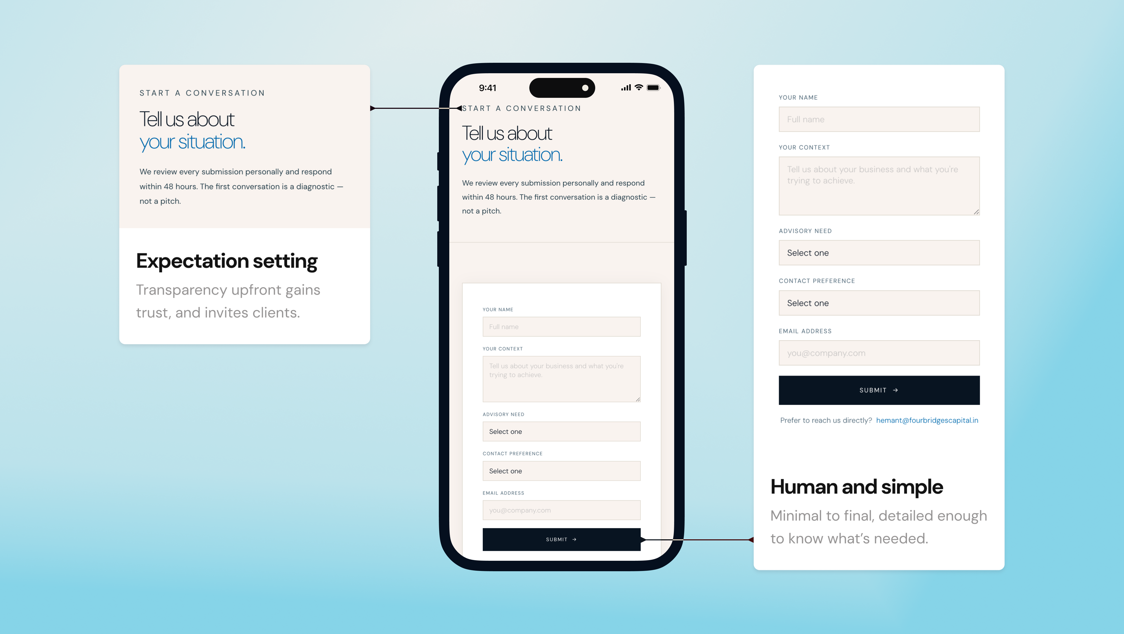
Engage: expectation-setting text before any form field
05 — Impact
Pre-qualified by design — before any human interaction
What changed
The platform now does the work of the first 30-minute conversation
The 'We Are Selective' section filters at the point of highest engagement. The Engage form surfaces context before any conversation begins. The Process page sets expectations that previously took a 30-minute call to establish.
For a one-person firm, the metric that matters isn't conversion rate — it's conversion quality. Three genuinely qualified enquiries per month, filtering out twenty unqualified ones, is worth more than thirty undifferentiated form submissions. That was the target.
No website, no intake process, and two key differentiators structurally invisible — with no conventional proof to show either.
Four Bridges had no website, no intake form, no structured way to receive or qualify inbound interest. All leads came through the founder's personal network. Every first conversation happened over WhatsApp.
There was no way for a referred founder to validate the firm before calling. No way to set expectations or assess fit — until the founder was already in the room.
"Four failure zones, each destroying a different part of the value proposition. The target band is a narrow corridor between institutional credibility and selective warmth."
End-to-end: IA, copy, qualification logic, UI, and build — with no logos, testimonials, or transaction references to draw on.
The scope was end-to-end. Not a visual layer applied to someone else's strategy — the IA, copy, qualification logic, and engagement structure were all designed from scratch.
Scope — End-to-End Engagement
Information Architecture
Defined the entire site structure — prioritising trust-building over browsing, since users couldn't rely on prior brand familiarity
Brand Voice & Copy
Wrote all copy to act as the primary trust layer — since no testimonials or proof points could be shown
Structured the journey from exploration to contact — guiding users through trust-building before prompting engagement
Platform Build
Designed in Figma. Built as static HTML/CSS with responsive design. Deployed via Vercel.
Analytics
Defined tracking to measure where trust breaks — CTA clicks, scroll drop-offs, and form completion
—C
Strategy & Information Architecture
Six IA principles emerged from stress-testing conflicting requirements — each a decision filter, not a guideline.
Six requirements were identified and tested against each other. They were frequently in conflict: credibility suggests complexity, but boutique positioning requires warmth. Filtering feels exclusionary, but unqualified leads destroy the product.
01
Modular Credibility
Multiple independent proof pathways. No single mechanism carries all the trust weight.
02
Guided Self-Selection
Users are helped to assess fit through positioning and clarity — not explicit filtering.
03
Strategic Founder Deployment
Systematize everything except the moments where the founders are irreplaceable.
04
Progressive Depth
Reveal information based on engagement signal. Don't front-load.
05
Relationship-First Architecture
Boutique warmth embedded in structural decisions — not just copy tone.
06
Outcome-Focused Measurement
Track deal quality, not enquiry volume. Metrics serve the business, not the platform.
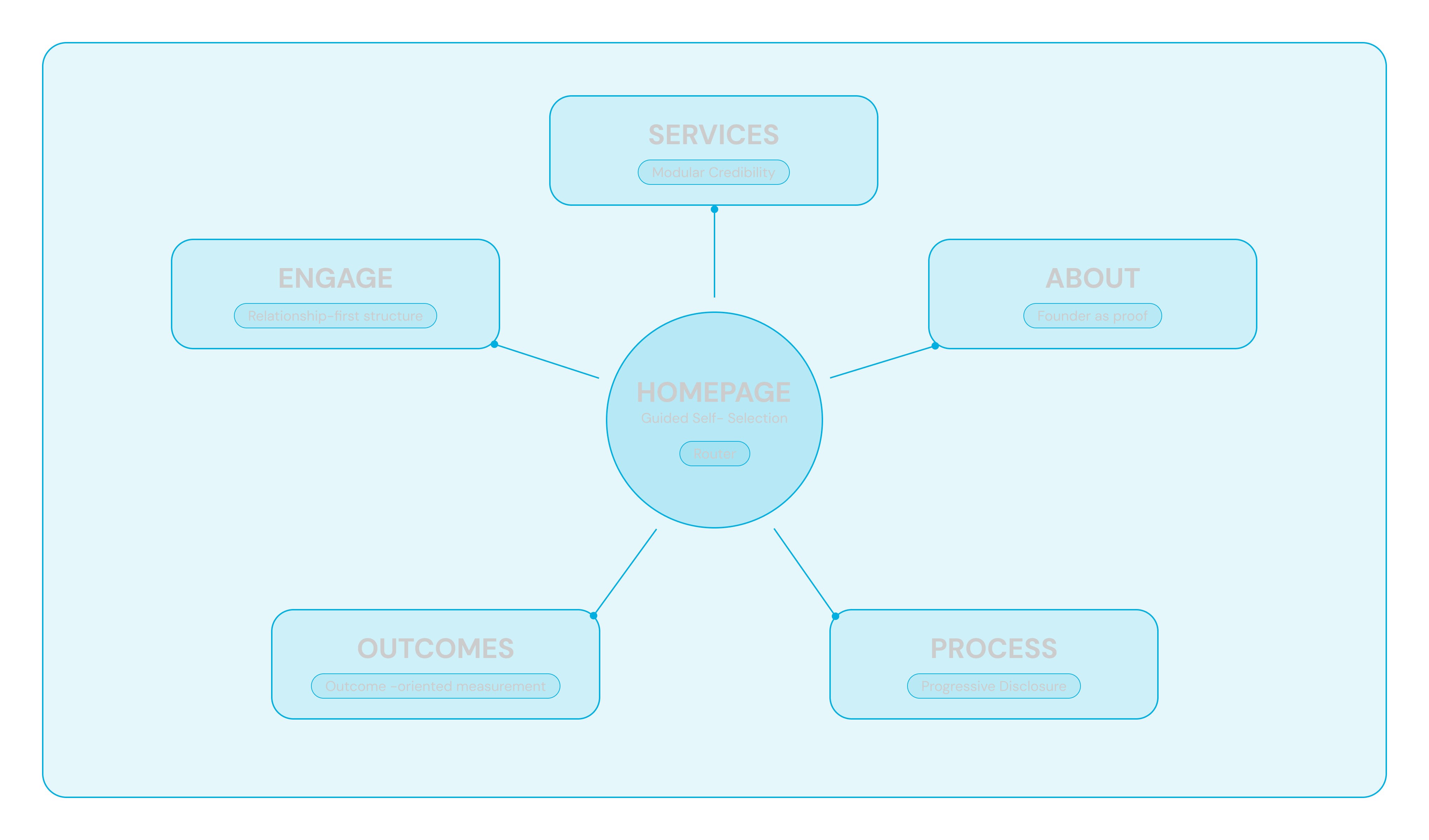
"Hub-and-spoke model — each page can serve as an entry point for a different prospect type, at a different stage of trust."
—D
All Key Decisions
Four structural choices — each validated against real founders before shipping.
⚡How do you qualify leads without gatekeeping?
What we chose
"We Are Selective" as a named, prominent homepage section
Placed before the Engage CTA — filtering at highest intent
"Assess Your Fit" CTA routing to structured intake form
The section functions as a psychological pre-qualifier, not a barrier. Founders who felt they "passed the filter" arrived with higher engagement and lower skepticism. Explicit selectiveness increased confidence in enquiries, not friction.
⚡Services — what to lead with: what we do, or what you achieve?
What we chose
Outcome-first — every service section opens with "What You Achieve"
Process detail follows as supporting evidence
"Ideal For" section provides self-qualification without exclusionary framing
Tested with founders who had worked with large investment banks, outcome-first addressed a consistent complaint: 'I never understood what I was paying for.' Leading with the result made the services section immediately relevant.
⚡How do you turn the founders' biography into an institutional trust signal?
What we chose
Hybrid structure — credentials establish the floor, the choice to leave establishes the differentiator
Departure framed as the thesis, not a career step
Client profile described in terms of who they are, not what they need
The credential-only version landed as 'impressive but indistinguishable.' The version including the departure decision generated a consistent response: 'this person has skin in the game.' The biography became evidence of alignment, not just capability.
⚡Italic emphasis — brand personality device or visual noise?
What we chose
Systematic serif italic on emotionally significant phrases across all major headings
No icons, no illustrations, no photography except one founder portrait
Financial services sites that lean on decoration read as marketing. The italic device was invisible to most readers — but every test version without it felt colder. Italics accumulate as personality without advertising it.
—E
The Build
Five pages, one narrative sequence — every section built to advance trust, activate self-qualification, or route toward engagement.
"Belief before proof — qualification happens before contact."
"The homepage doesn't sell. It sorts."
"The homepage doesn't sell. It sorts."
"Two mobile-specific decisions: the nav surfaces the highest-intent CTA on first tap; the form leads with context before contact details."
—F
Reflection
Copy as primary design output was the right call; the diagnostic intake form was the wrong cut from MVP.
What worked
Treating copy as a design output — not a hand-off — changed the quality of every section. When the words are designed with the same intent as the layout, the result feels coherent rather than assembled. The italic device is the clearest evidence: it came from a copy decision, not a visual one, and unified the site's personality more than any graphic element could have.
What I'd change in V2
Three things. First: a diagnostic intake form — specified in the IA document but cut from MVP. It should have been in scope from day one. Second: scroll-triggered reveal on the Process page — a sequential process should feel sequential on screen. Third: a writing section for the founders' market perspective. Thought leadership compounds. Every month without it is a missed asset.
The constraint that shaped every decision in this project — showing credibility without conventional proof — is also what made the platform interesting to design. The absence of logos and testimonials forced a more rigorous argument. That argument is the product.