Prevention doesn't sell itself. Every other pet care product on the market has urgency built in — something is already wrong when the customer reaches for it. The brief was to build a brand and a Shopify storefront that could introduce a category that didn't yet exist in India, and make a first-time visitor care about preventing a problem they hadn't experienced yet.
My Role
Brand · IA · Custom Shopify Dev · Photography Art Direction
Scope
Brand Identity · IA · Shopify Build · Photography Art Direction
Sol & Sky entered a category that didn't exist yet in India — and had to make a first-time visitor care about preventing a problem they hadn't experienced yet.
What I did
Diagnosed the issue as information architecture before touching visual design. Brand strategy, IA, custom Shopify development, and photography art direction — from founding brief to live launch.
What changed
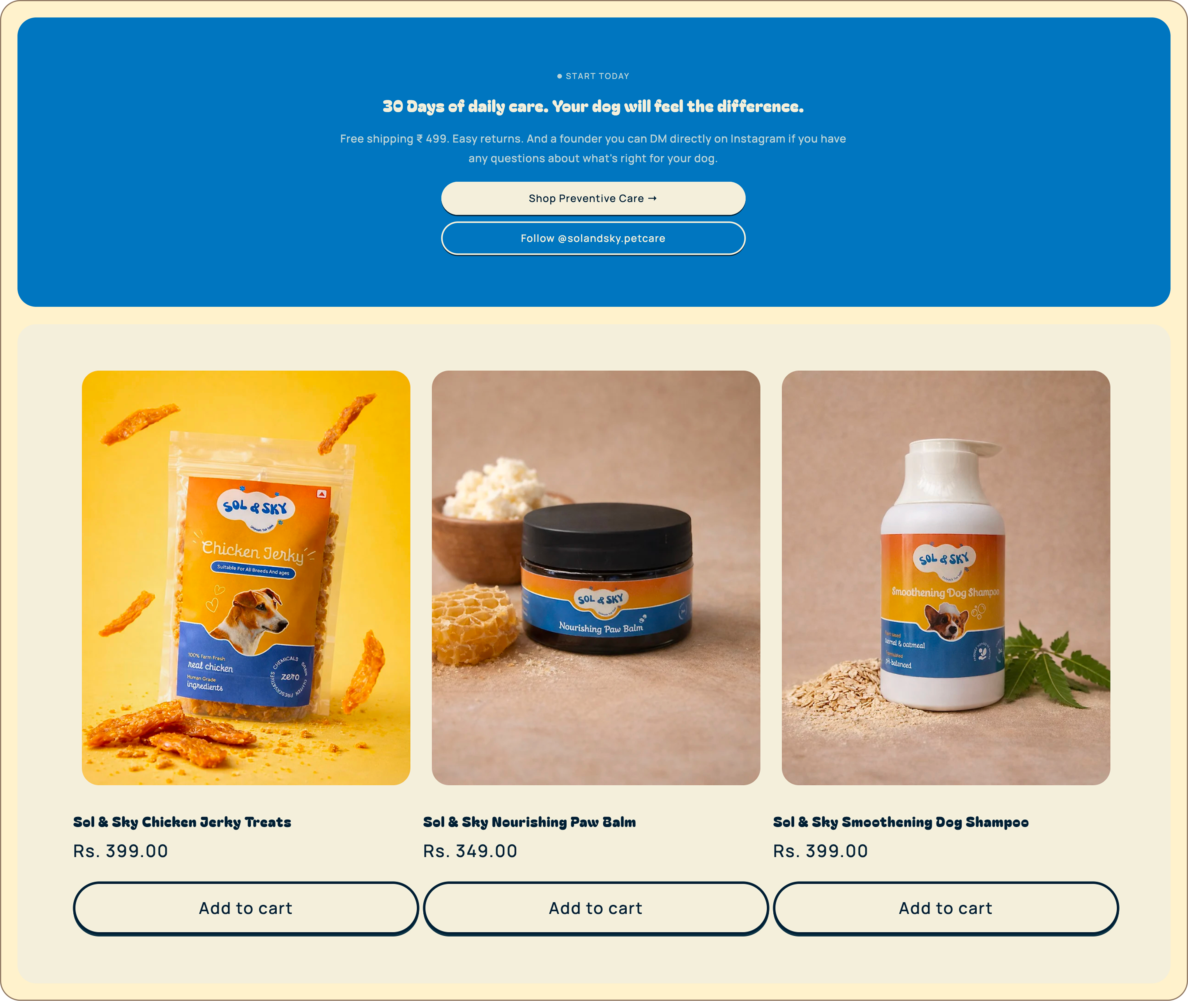
10 products live. Three categories unified by one daily routine. Site live at petsofsolandsky.com — from brief to shipped in 12 weeks.
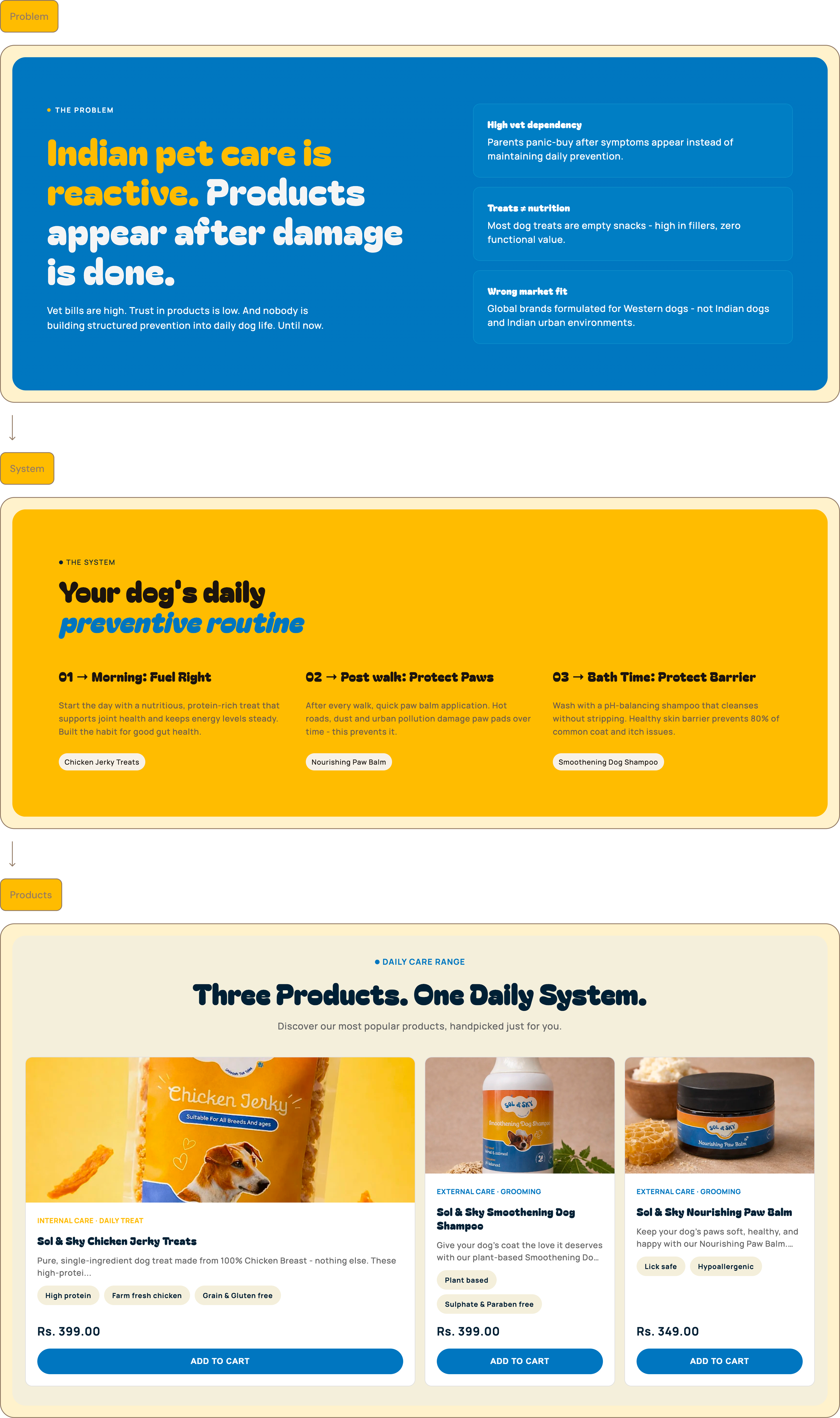
01 — Problem
Sell prevention to customers who've never needed it yet
Indian pet care runs on panic. The entire product ecosystem is built on symptoms — something has already gone wrong by the time a product enters the picture. Sol & Sky's premise was different: gut problems, damaged paw pads, skin barrier breakdown — the three most common issues Indian dog parents face — are entirely preventable.
"How do you sell a product whose entire value proposition is that you'll never need to prove it worked?"
That question shaped every content hierarchy decision on the site. The design problem wasn't how to explain the logic of prevention. It was how to make a first-time visitor feel it before they'd ever experienced the alternative.
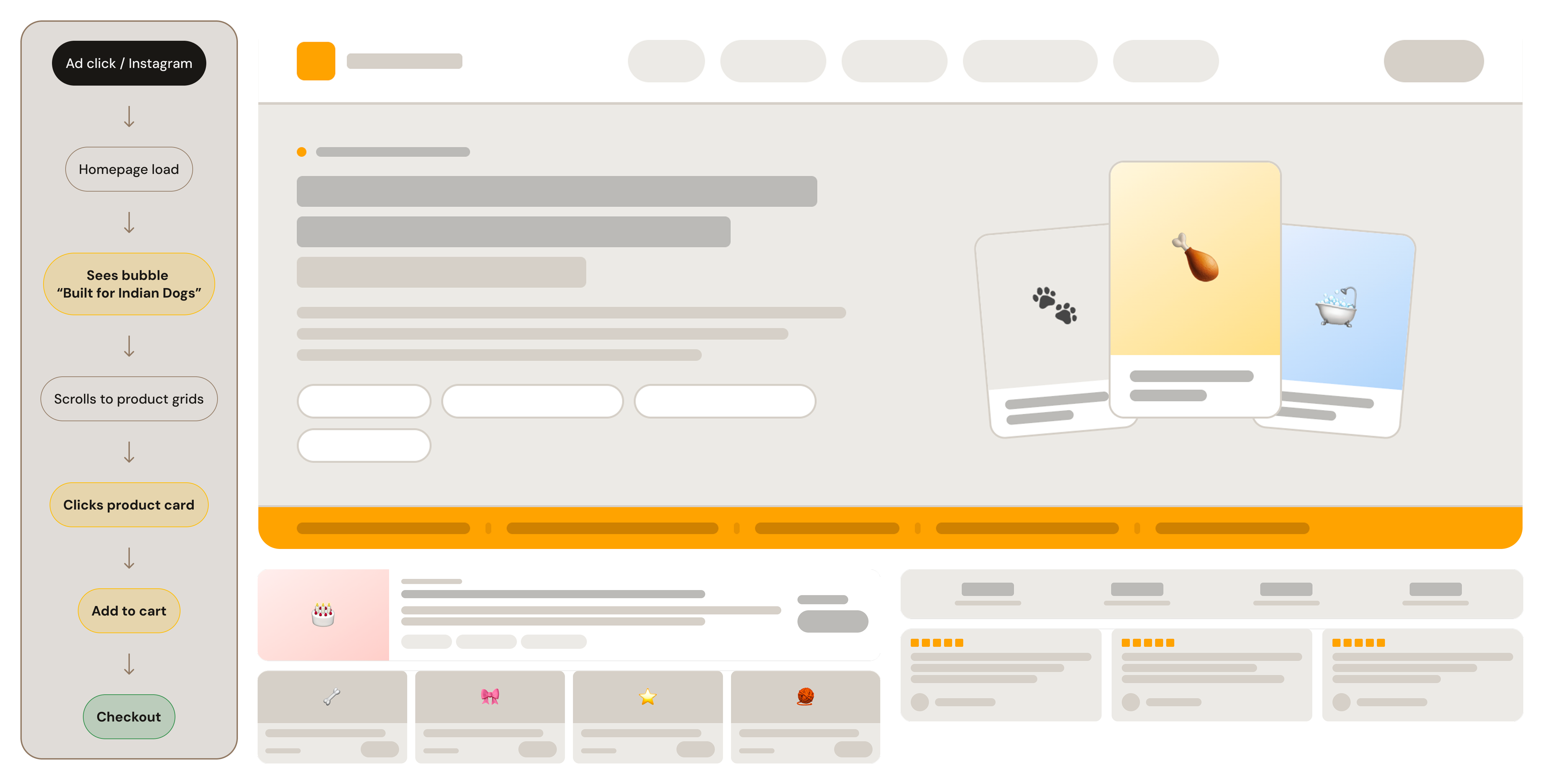
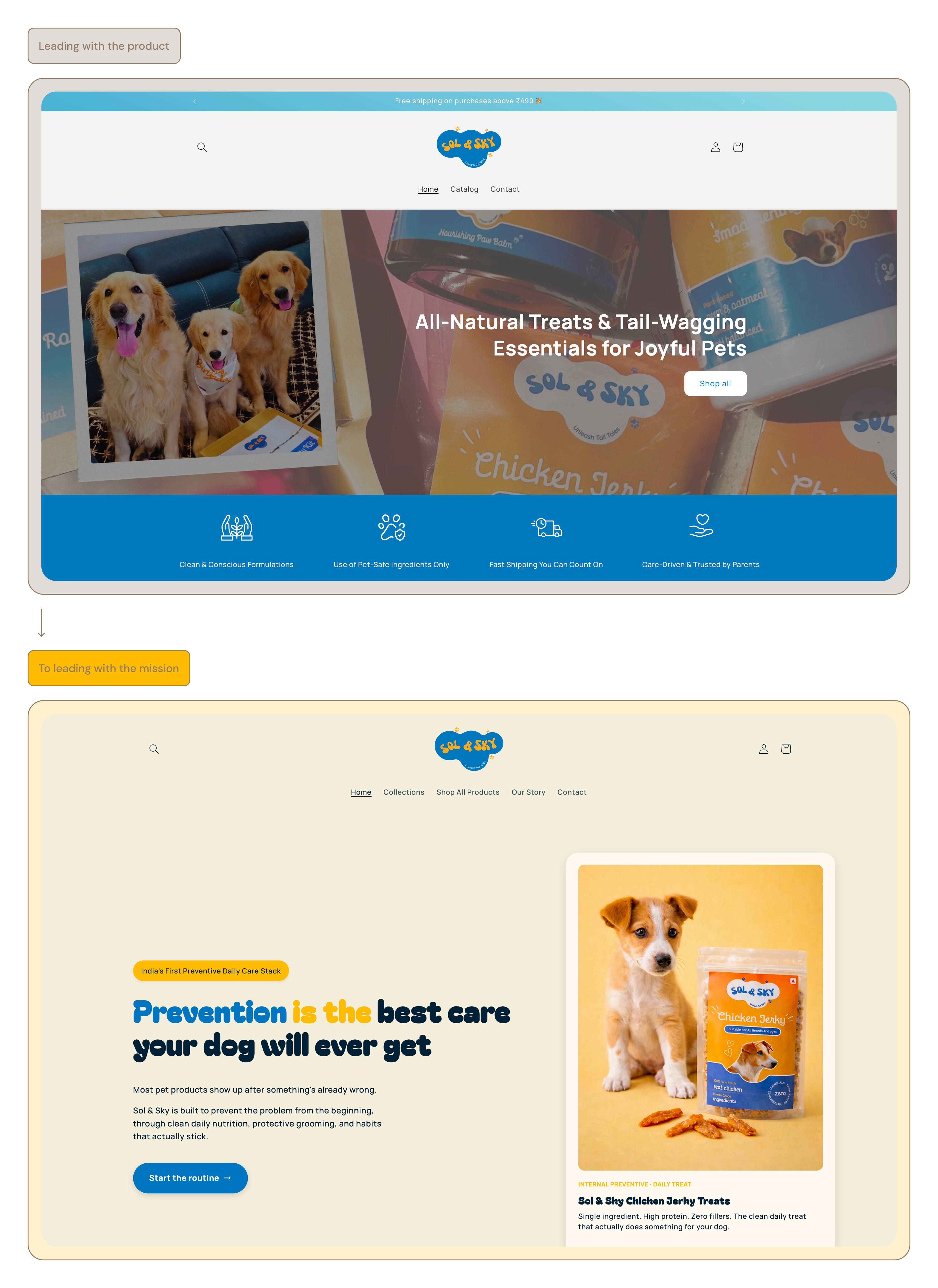
Sol & Sky was built on a different premise: that the three most common issues Indian dog parents face — gut problems, damaged paw pads, skin barrier breakdown — are entirely preventable. The conversion problem wasn't visual — it was structural. The browse-and-discover architecture was asking customers to evaluate individual products before they understood the category. That's an IA fix, not a styling one. The design problem was how to make a first-time visitor feel the logic of prevention before they'd ever experienced the alternative.
02 — Key Constraint
₹399. Zero brand recognition. No category precedent.
At ₹349–₹399 with zero brand recognition at launch and no existing mental model for "preventive pet care" in India, Sol & Sky couldn't compete on price. The customer who buys a ₹399 single-ingredient treat instead of a ₹99 filler-heavy one is making a values-based decision, not an economic one.
⚡
The binding constraint
No social proof. No category precedent. No existing mental model to borrow from.
The website's job isn't to justify the price — it's to earn the values fit. Every design decision was filtered through one question: does this feel like a brand that takes its ingredients as seriously as it claims?
Shopify theme architecture — every decision had to work within template constraintsFirst-to-category — no existing mental model for "preventive pet care" in IndiaUrban Indian millennial dog parents — high emotional investment, low patience for jargon₹349–₹399 price point — must feel considered and premium, not cheap D2CZero social proof at launch — credibility built structurally, not through reviews
03 — Key Decision
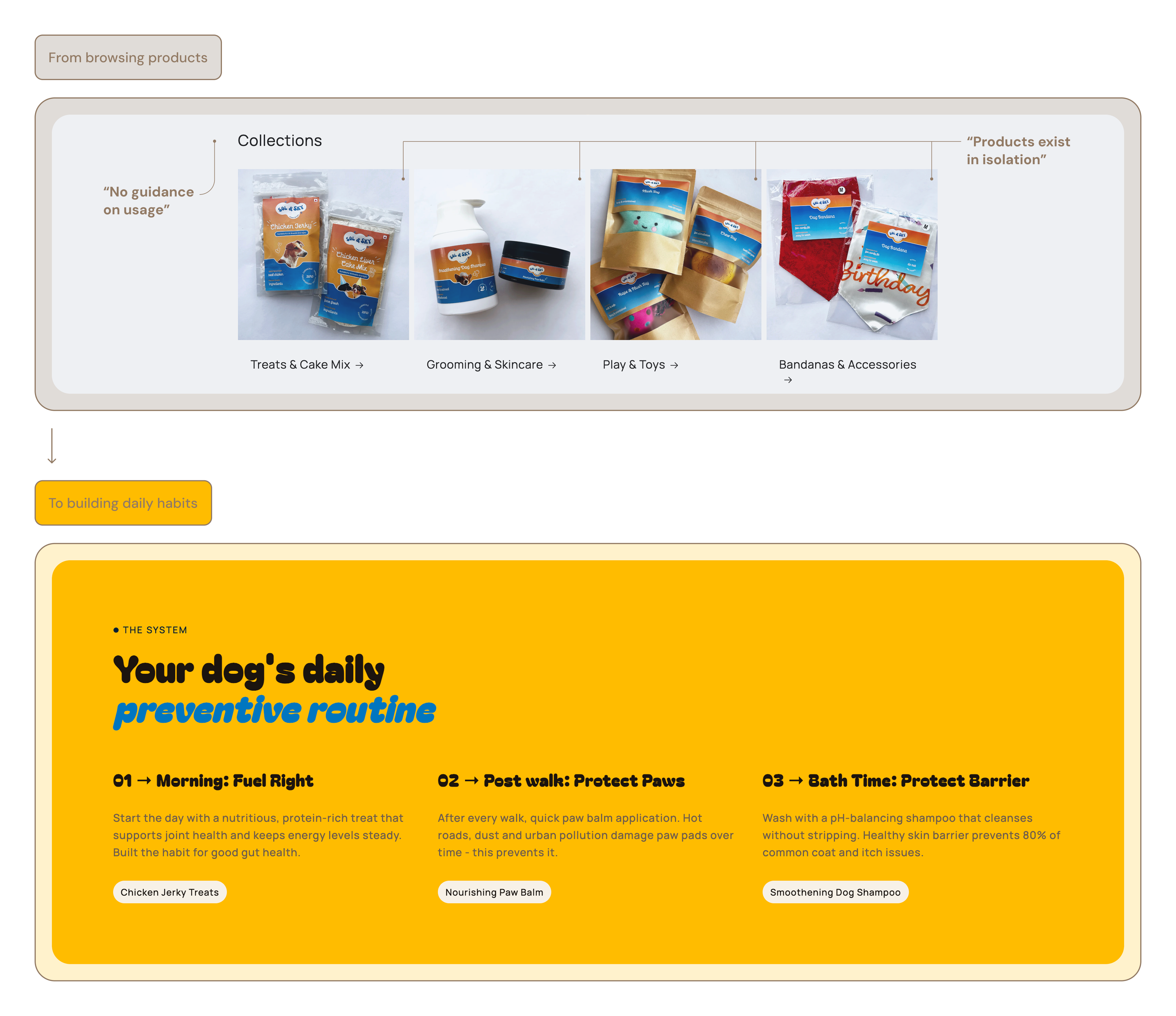
Products aren't separate items — they're a daily habit
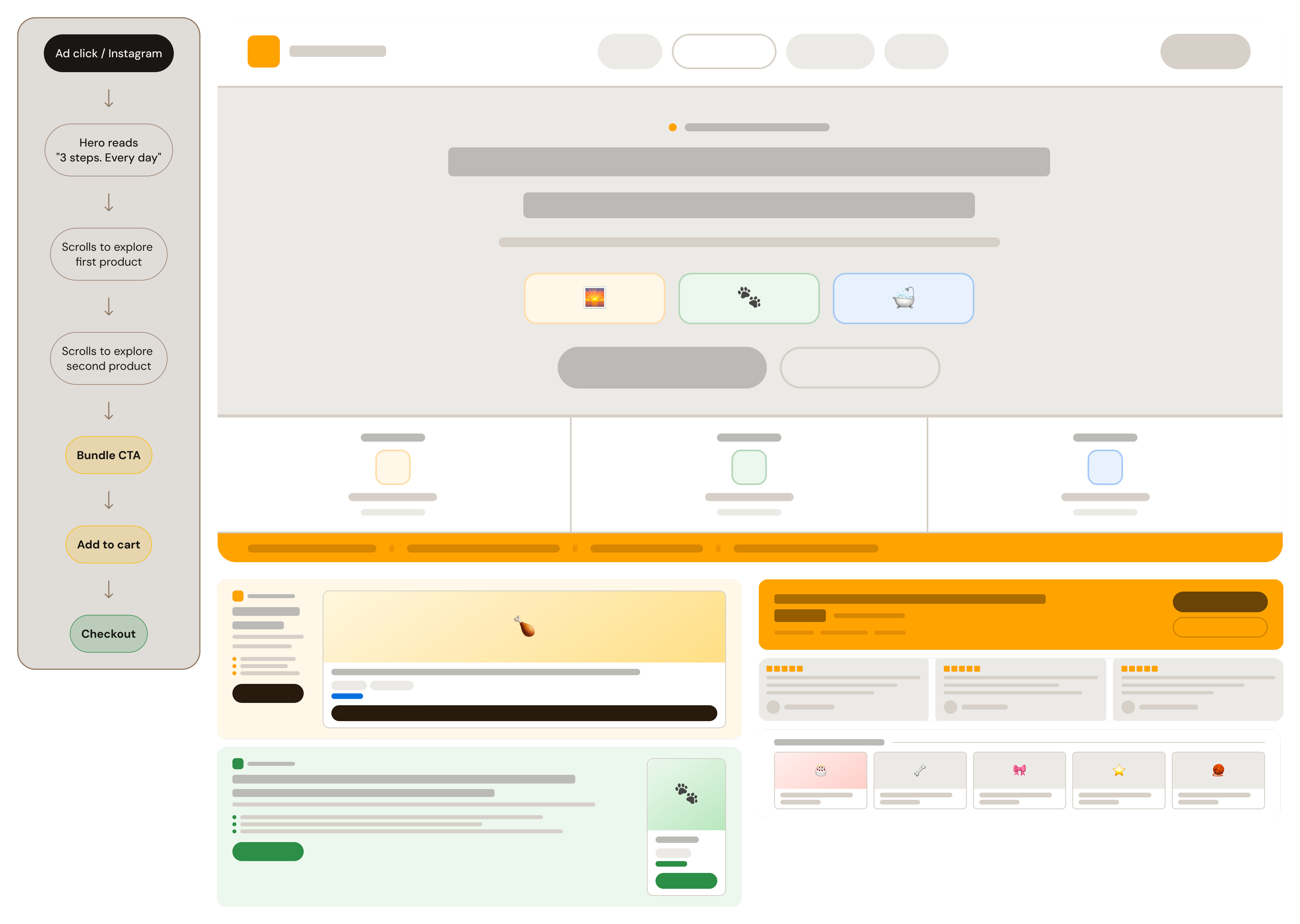
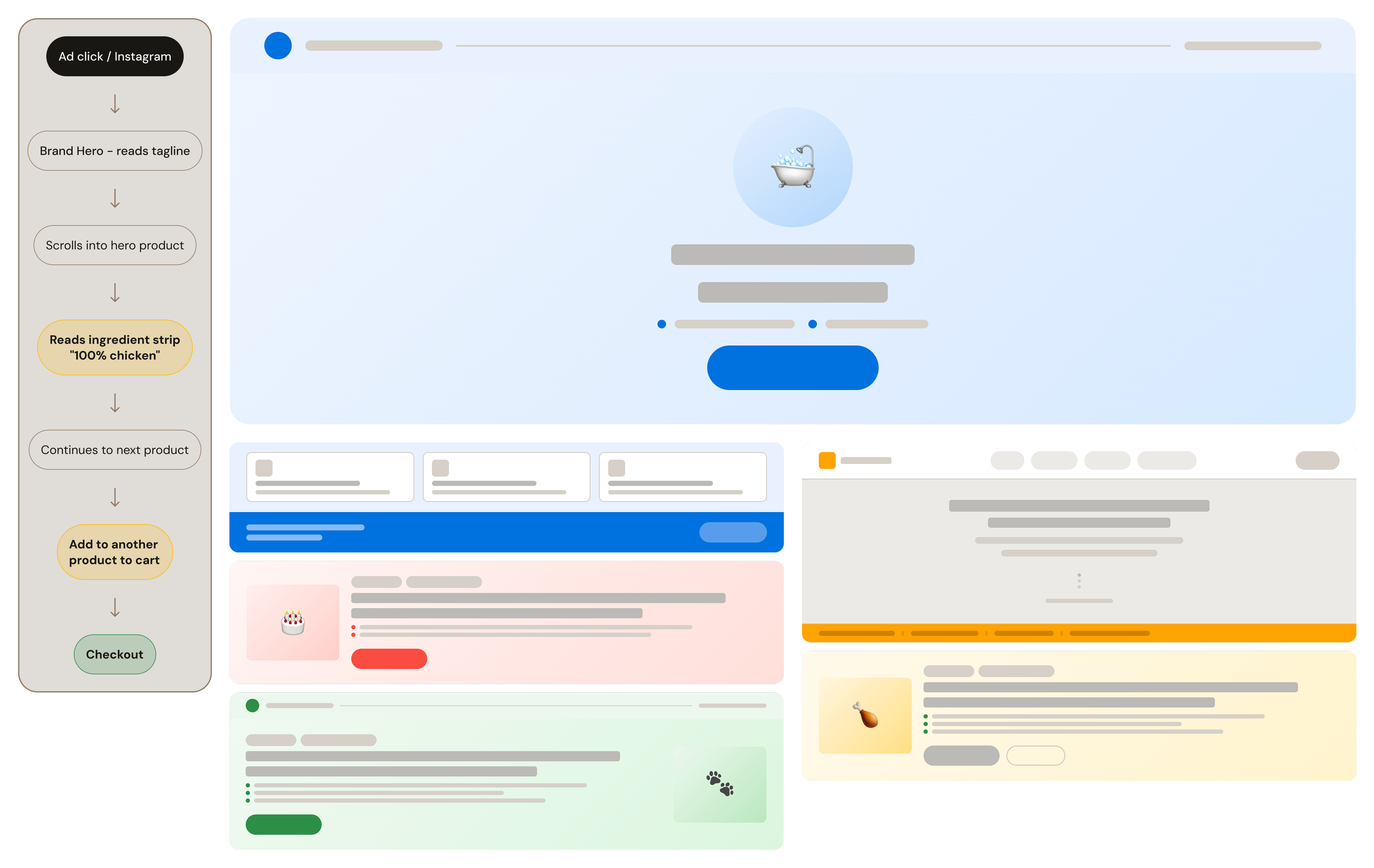
The most important design decision wasn't about visual language or layout — it was about product architecture. Selling individual products is a standard e-commerce problem. Selling a daily routine is a brand-building problem. The distinction determined the entire homepage structure.
⚡Sell products individually or frame them as a daily system?
What we chose
Three-step daily routine (Morning → Post-Walk → Bath Time), each mapped to one product. Products are introduced as components of the habit, not as individual items to browse. Collections architecture is retained for users who want to search, but is never the primary entry point.
Brand loyalty in preventive care depends on habit formation, not repeat impulse. The system framing is a lifetime value decision disguised as a homepage design decision. A customer who adopts the routine is structurally retained — the product is embedded in their daily behaviour.
04 — Solution
One entry point. Three products. One habit.
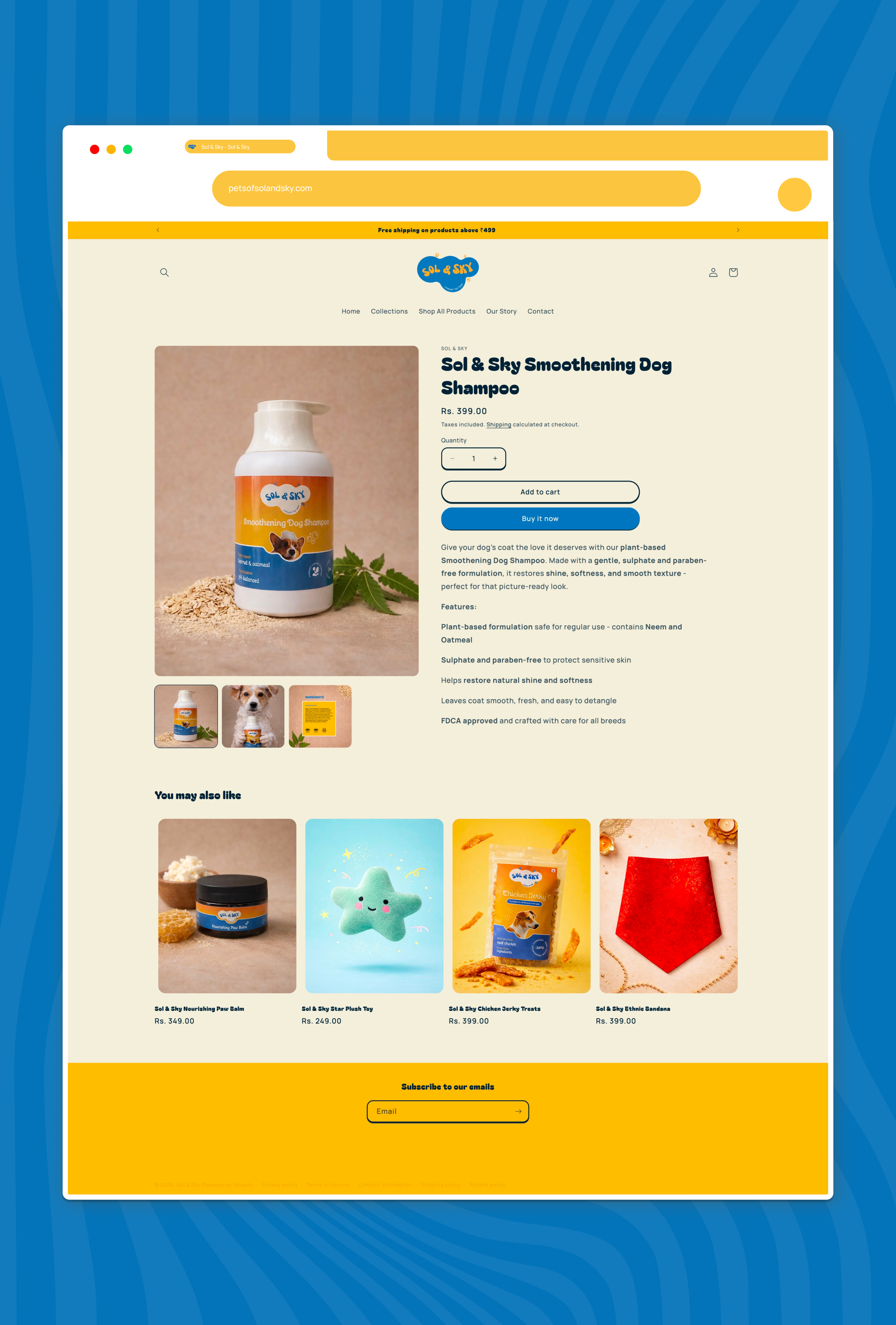
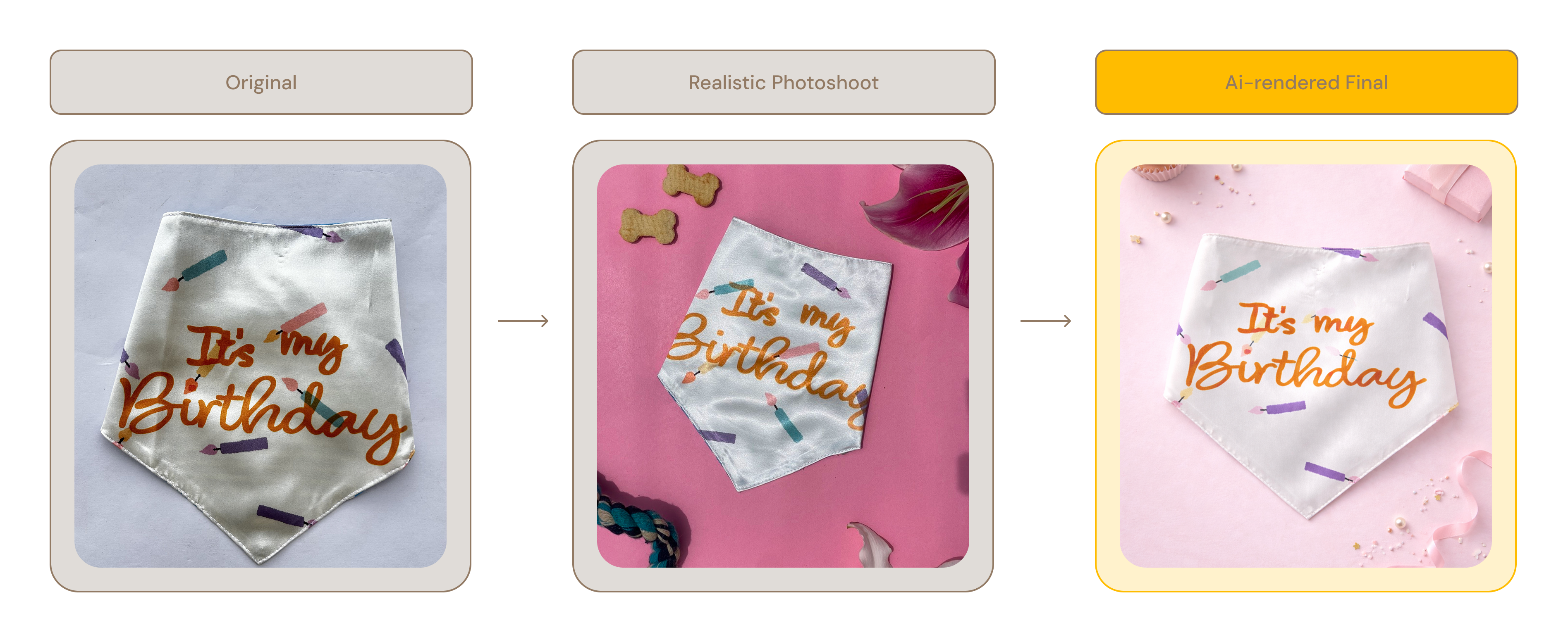
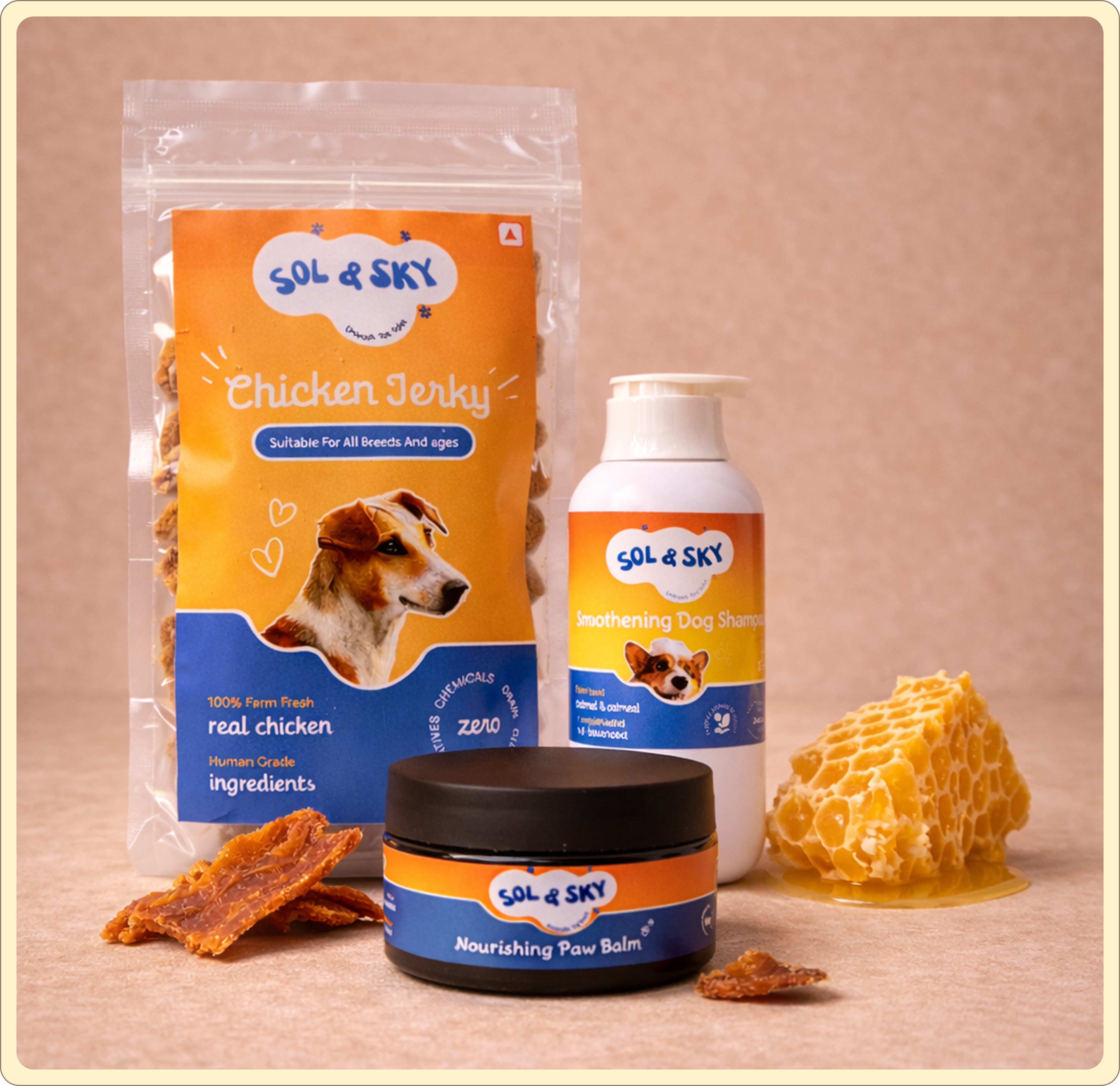
The website, naming convention, and photography were designed as a single coherent system. The homepage leads with the problem before showing a single product. The daily routine converts the product range from a catalogue into a habit. Ingredient-forward photography makes the brand's most important claim — clean formulation, no fillers — visual without requiring the visitor to read anything.
The daily routine — three separate products converted into one habit, embedding the brand in the customer's day
The daily routine — three separate products converted into one habit, embedding the brand in the customer's day
The daily routine — three separate products converted into one habit, embedding the brand in the customer's day
05 — Impact
3 products. One system. Live at launch.
What changed
Three categories. One daily routine. No one asked to choose.
3 products live across internal care, grooming, accessories, and gifting — all under one brand and design system. The problem-first homepage architecture makes the preventive care category legible to a first-time visitor before a single product is shown.
From brief to shipped in 3 weeks. Brand, website, and product system in production as a single engagement with one founder and no PM layer.
The brief was brand strategy, Shopify build, and photography art direction as a single engagement — for a brand entering a category with no existing mental model in India. The homepage leads with the problem before showing a single product because that's the only structure that makes the category legible to someone encountering it for the first time.
Context & Team
Sol & Sky came to me with a clear founding thesis — prevention over reaction — but needed a digital expression that could carry that idea to a customer who had never heard it before. The founder had spent months fostering dogs, reading ingredient labels, and talking to vets before launching. The brand thinking was sharp. What it needed was a design system and a Shopify build that could translate that thinking into a purchase decision within a single scroll session.
Design — Manav Hemnani
Brand + Shopify Designer
Led brand design, Shopify theme customisation, IA, content hierarchy, and art direction for product photography. Built the daily habit framework as the primary navigational logic of the homepage.
Direction — Founder
Sanika Shahane
Product vision, formulation brief, brand naming, and sign-off. No PM layer — all design decisions were made directly with the founder, which compressed iteration cycles and raised the stakes of every call.
Platform — Shopify
Theme Architecture
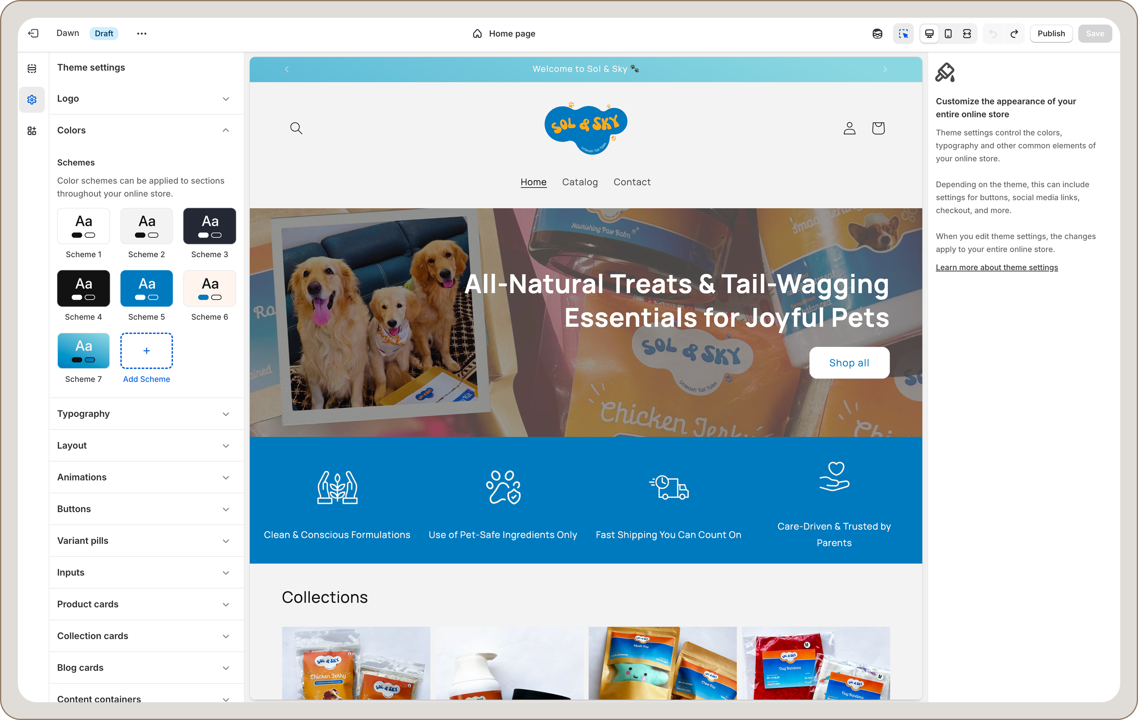
Platform constraints shaped every IA and content hierarchy decision. Custom sections were built within theme architecture, and every layout decision had to work within Shopify's rendering model.
Working directly with Sanika Shahane — no PM, no brief document, no feedback layers — meant every decision was made against her founding conviction rather than a spec. When a direction felt off, the filter was always the same: does this feel like a brand that acts before problems appear?
Working within Shopify's theme architecture — every layout and content hierarchy decision was made against real platform constraints, not a greenfield canvas.
—B
Scope & Constraints
Shopify architecture, first-to-category, zero social proof, and a price point that requires trust before conversion — four constraints that shaped every design decision.
Shopify theme architecture — no custom front-end, every decision had to work within template constraintsFirst-to-category — no existing mental model for "preventive pet care" in India to borrow fromUrban Indian millennial dog parents — high emotional investment, low patience for jargon₹349–₹399 price point — must feel considered and premium, not cheap D2CZero social proof at launch — credibility had to be built structurally, not through reviews or press
The audience held two distinct mindsets: first-time pet parents actively seeking education, and experienced owners looking for cleaner alternatives. The site had to educate without condescending, and signal premium quality without requiring prior category knowledge.
—C
Process & What Didn't Work
Two directions abandoned for the same reason: both led with what the brand wanted to show rather than what the visitor needed to understand first.
01
Product-First Homepage
Content hierarchy — hero leads with product range, grid of items above the fold
Abandoned
No context = no purchase. A visitor who doesn't understand "preventive care" sees a ₹399 shampoo and doesn't know why it's different from the cheaper alternative
02
Per-Product Benefit Sections
Structural IA — each product has its own hero with benefit claims, no overarching brand frame
Abandoned
Fragments the brand into individual products. The "daily system" thinking — the brand's actual differentiation — never emerges when each product stands alone
↓
Problem-First Narrative → System → Product Reveal
Single confident hierarchy · problem named before any product is shown · products positioned as components of a daily habit, not standalone items
Shipped
One entry point. One belief to establish. Every product earns its place in the system rather than competing for attention on its own.
The abandoned directions share the same failure: they led with what the brand wanted to show rather than what the visitor needed to understand first. A product grid without context is just noise. Benefit claims without a framework are just marketing copy. The alternative — naming the problem before showing a single product, and framing every product as part of a system — is harder to earn confidence in. But it's the only structure that makes the category legible to someone encountering it for the first time.
—D
All Key Decisions
Three decisions that determined how the site establishes trust, structures product architecture, and communicates formulation quality — each resolved through the same lens: earn belief before asking for purchase.
▶Homepage hero: lead with the product, the benefit, or the problem?
Options considered
Product hero — grid of items and add-to-cart above the fold
Benefit hero — "Your dog deserves better" headline with product imagery
Problem hero — name the reactive care problem before showing anything
Outcome hero — state the result, let the product follow
What we chose
Outcome headline as the opening statement ("Prevention is the best care your dog will ever get")
Explicit problem section directly below the fold — before any product is revealed
Products introduced only after the visitor understands the category
At ₹349–₹399 with zero brand recognition at launch, an impulse purchase is unlikely regardless of homepage structure. The customer who will convert needs to understand why this product is different from cheaper alternatives. Problem-first priming is the only structure that makes the price differential legible. Delaying the product reveal was a deliberate trust decision, not a conversion oversight.
⚡Sell products individually or frame them as a daily system?
Options considered
Standard e-commerce — individual product pages as primary entry points
Category navigation — Internal Care / External Care / Accessories
Lifestyle narrative — "everything your dog needs" without structure
Daily habit system — three numbered steps mapping each product to a time-of-day moment
What we chose
Three-step daily routine (Morning → Post-Walk → Bath Time), each mapped to one product
Products introduced as components of the habit, not as individual items to browse
Collections architecture retained for users who want to browse, but never the primary entry point
A customer who adopts the routine is structurally retained — the product is embedded in their daily behaviour. The system framing is a lifetime value decision disguised as a homepage design decision.
▶Lifestyle photography or ingredient-forward photography as the primary visual language?
Options considered
Lifestyle: happy dogs, golden hour, owner-dog interaction, emotional warmth
Product-only: clean studio shots on white background
Ingredient-forward: raw ingredients visible alongside the product
Mixed: lifestyle for hero, ingredient-forward for product pages
What we chose
Ingredient-forward as the primary visual convention across all product photography
Dog-interaction photography as secondary — used in product image carousels, not as hero images
White/neutral surfaces throughout — no lifestyle staging
The brand's single most important claim is clean formulation — no fillers, single-ingredient, plant-based. Any photography convention that doesn't foreground the ingredients leaves that claim to the copy, which requires reading. Ingredient-forward photography makes the claim visual. For a new brand with zero social proof at launch, visual credibility is more valuable than visual warmth.
—E
The Build
Website, daily routine framework, and ingredient-forward photography designed as one system — the naming convention, photography style, and page hierarchy all reinforce the same single idea.
The website, product naming, and visual language were designed as a single coherent system. The naming convention — "Smoothening Dog Shampoo," "Nourishing Paw Balm" — mirrors the ingredient-first brand philosophy: functional, honest, no marketing abstraction. The three-step daily routine maps each product to a specific daily moment, converting the product range from a collection into a habit. The ingredient-hero photography signals clean formulation through visual convention rather than copy claims.
The hardest part of making this system coherent was the tension between ingredient-forward photography — which signals clinical trust — and the emotional warmth that dog parents respond to. The resolution: lead with ingredients in product and hero shots, and reserve dog-interaction photography for secondary carousel images. Warmth is present, but never leads.
The result is a brand where everything — the name, the photography style, the page hierarchy, the routine framing — reinforces the same single idea: this brand is honest about what's in its products and serious about preventing problems rather than treating them.
Ingredient-forward photography makes the brand's single most important claim — clean formulation, no fillers — visual without requiring the visitor to read anything.The daily routine converts three separate products into one habit. A customer who adopts the routine becomes structurally retained — the product is embedded in their day, not competing for attention at re-purchase time.
10
Products live across internal care, grooming, accessories, and gifting — all under one brand and design system
3
Distinct product categories unified by a single daily habit framework — positioned as a system, not a catalogue
Live
Brand, website, and product system in production — from brief to shipped within a single engagement
—F
Reflection
What worked
Working directly with a founder who had done the hard thinking on brand positioning before the design engagement started made every creative decision faster and more precise. Sanika's founding thesis — prevention over reaction — was clear enough to function as a design filter. Every layout choice, photography decision, and content hierarchy question could be resolved by asking: does this communicate a brand that acts before problems appear, or one that waits for them? That kind of clarity at the brief stage is rare, and it compressed what could have been a slow discovery process into sharp, decisive execution.
What I'd change in V2
Shopify's constraints shaped more decisions than I named upfront. Some workarounds are visible if you look closely. In V2, I'd surface the platform limits at the brief stage — not to lower expectations, but to route design decisions through them deliberately rather than hitting walls mid-build.
Selling a new category is fundamentally a narrative design problem, not a product design problem. The customer doesn't need to be convinced the products work — they need to understand why prevention matters before they'll consider the category at all. Leading with the problem, then offering the system, then revealing the products is a content architecture pattern I'd apply to any early-stage D2C brand entering an underserved or newly defined market.